Global One-Stop Service Center Mascot Design
This project involved reinterpreting an existing visual identity for a campus service center through the creation of a brand mascot. The organization previously used a globe symbol, which served as the conceptual starting point for the redesign.
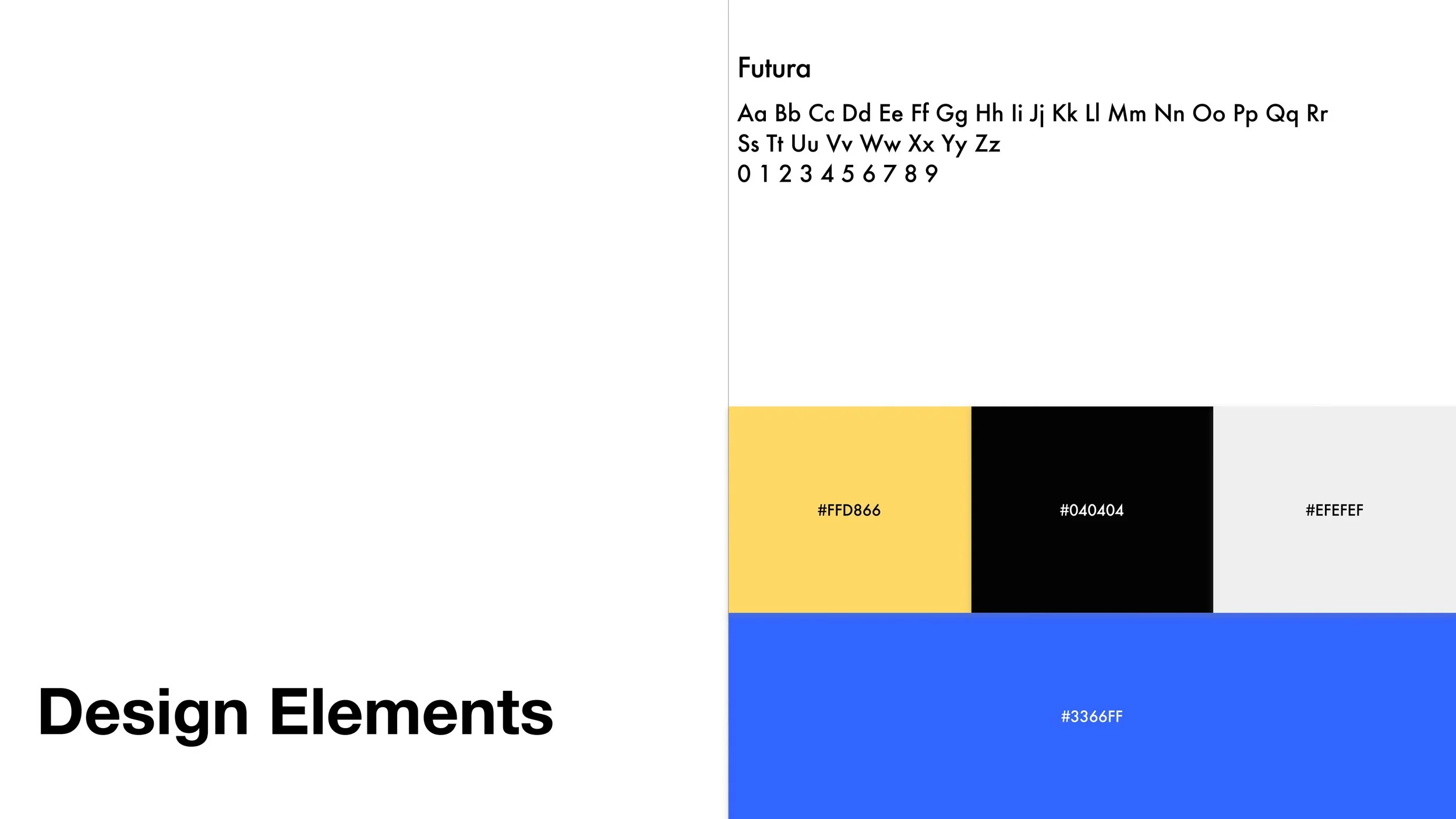
Rather than replacing the original symbol, the globe was transformed into a character named Bobo, giving the brand a more approachable and personable presence. The mascot retains the recognizable world shape while introducing simple facial features and expressive forms, allowing the identity to feel friendly and accessible without losing its original meaning. The color palette and minimal shapes were chosen to ensure clarity and adaptability across digital platforms.
Designed primarily for social media and digital communication, the mascot functions as a flexible visual asset that humanizes the brand and supports ongoing engagement. The final result translates an abstract symbol into a character-driven identity that can evolve across posts, campaigns, and announcements.

![[GOSC] Mascot.png](https://images.squarespace-cdn.com/content/v1/697088cc1d4e7f2bb6228879/7ed3bba7-73ff-4253-9288-81bd4585a6a8/%5BGOSC%5D+Mascot.png)

